Play-Doh
Let’s make stuff!
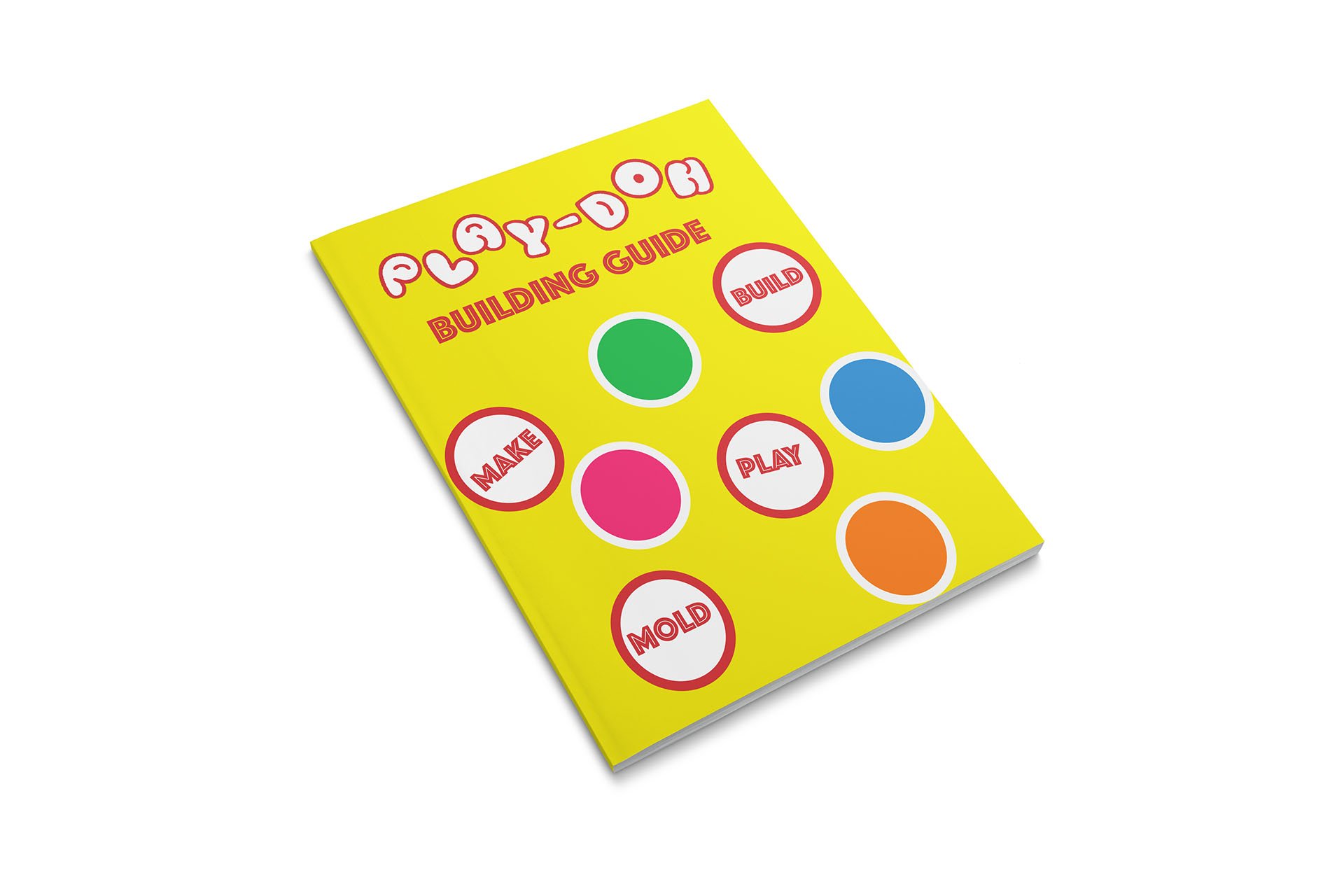
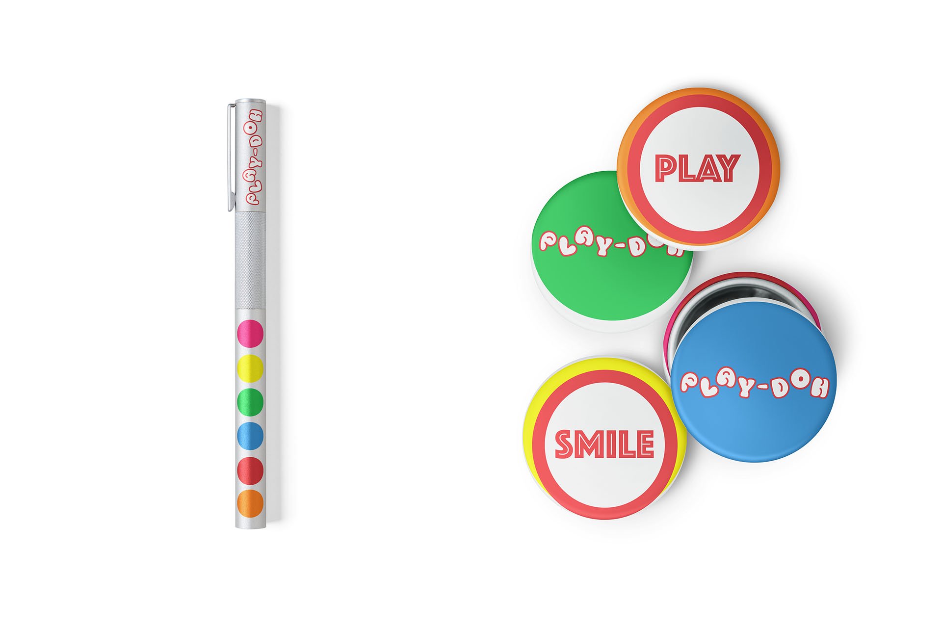
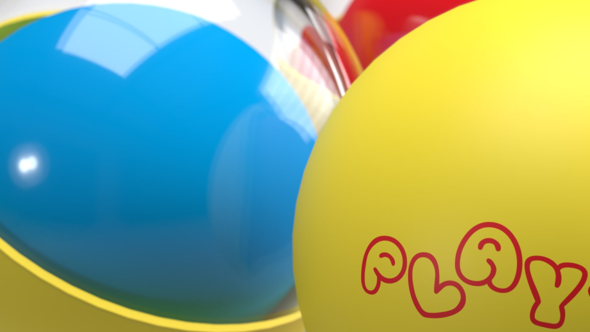
The objective of this project was to modernize the Play-Doh brand. I wished to retain the feel of the original logo, while giving it a cleaner, more uniform use of space. I completely re-imagined the packaging, while also adding a secondary storage container. The balls symbolize the simplicity of our childhood creativity. Like the Play-Doh itself, the sphere to a child can take the place of many different things. Many of the brand elements used on the touch points and website also play off of the sphere and container concept.